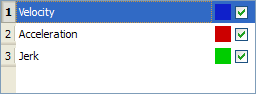
With the check boxes in the Curve selection table shown in figure below, you can select or clear each individual curve to be displayed.
When a curve is selected (see blue highlighted row in figure below), the Y-scale of the Curves graph is adjusted to display the Y-scale of the selected curve. Also, the color of the 'tick' line of the scale is changed to match the color code of the selected curve.
Figure 10-14: Curve Selection Table
You can change the color of a plot as follows:
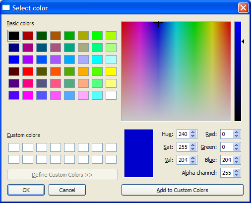
Figure 10-15: Standard Color Selection
|
Stay Connected with Kollmorgen       
|
Copyright © 2015 Kollmorgen™ |

|